Luxury used to announce itself at the door: a special-occasion dress, a hotel suite, a garment saved for the right evening. Now it is just as likely to show up at home, in clothes chosen for an ordinary Tuesday night. The best sleep sets understand that shift. They don’t need to sparkle or declare a price point. They feel considered against the skin, look composed enough to answer the door, and hold up to the small routines that make up a life.
That change has brought sleepwear closer to daywear—and wellness language closer to fashion branding. But a premium sleep set is more than a matching top and bottom in a muted color. Its quality comes through in decisions you can feel and inspect: fabric weight, seam placement, finishing, fit, and the way a garment behaves after washing. The details do the talking. A logo can work like a logo; thoughtful construction works like proof.
In PAGE Magazine’s Reverie PAGE, that conversation can be approached with the same curiosity readers bring to clothes they wear outside the bedroom. A useful editorial question is not simply, “Does this look luxurious?” It’s “What, specifically, makes it feel better to wear?”
Luxury Has Moved Into the Everyday
When people bring luxury into daily routines, the definition changes. A sleep set is not valuable because it is reserved for a rare moment. It earns its place by being the thing someone reaches for repeatedly: comfortable at bedtime, presentable over breakfast, and easy to care for between wears. That kind of use puts pressure on the design. Fabric that feels lovely for five minutes but twists after a night’s sleep is not doing the job.
The shift also makes the boundary between sleepwear and loungewear less rigid. A shirt with a clean collar, trousers with a useful rise, or a restrained stripe can make a set feel ready for the whole morning, not just the bed. This is sleepwear cut like daywear: relaxed enough to sleep in, but shaped and finished with the clarity of clothes meant to be seen.
That doesn’t mean sleepwear should become a miniature office outfit. The point is not to add structure for structure’s sake. It is to borrow the parts of daywear that help clothes hang well and feel intentional, then leave out anything that restricts movement. A pocket should lie flat. A waistband should stay comfortable when sitting or sleeping. A button placket should not feel like a hard ridge against the chest.
Wellness Language Needs a Material Basis
Fashion has absorbed the language of wellness. Brands talk about rest, recovery, comfort, and feeling good in one’s body. Those ideas can make sense in sleepwear, but they should lead to concrete product choices, not vague promises. “Made for rest” is a positioning line. The useful questions are about what the garment is made of, how it is constructed, and what the wearer can verify.
For example: Is the fiber content clearly listed? Is there a care label with realistic instructions? Does the brand explain the fabric’s weight or weave, rather than relying on adjectives such as “cloud-like”? If a company makes a technical or wellness-related claim, does it provide documentation that supports it? A sleep set does not need to promise a health outcome to feel premium. In fact, a grounded description of the fabric and fit is often more persuasive than a sweeping claim about sleep quality.
The same standard applies when fashion brands sit beside wellness companies in the conversation. Lululemon is a useful reference point for how a clothing brand can make comfort and performance central to its product identity. Joy Organics, by contrast, is a wellness company rather than a sleepwear label; its presence in a broader conversation about routines is a reminder to distinguish a brand’s category from the claims attached to its products. A name associated with wellness does not, by itself, establish what a garment will do—or https://highstylife.com/what-makes-a-wellness-product-feel-luxury-day-to-day/ how it will feel.
For editors and shoppers alike, the reliable details remain the basics: materials, construction, fit, care, and clear sourcing information where available. Wellness language can frame the mood. It cannot replace the product facts.
Quiet Status Signals Are Often the Most Useful Ones
Quiet luxury is often discussed as a visual style: neutral colors, minimal branding, clean lines. But a logo-free surface is not evidence of quality. Quiet status signals are more convincing when they are functional. A seam that lies flat. A print that lines up at the side seam. A button that is securely attached and comfortable to sleep against. A fabric that drapes without clinging or turning limp after laundering.
Those details are not always obvious in a product photo. That’s why good product pages and editorial coverage matter. A close-up can show the finish at a cuff or placket. A fit note can explain whether the trousers are designed to sit at the waist or lower on the hip. Care instructions can tell a shopper whether “easy care” means machine washable, tumble dryable, or simply easy to look at in a photograph.
There is also a difference between understated and anonymous. A subtle contrast piping, a distinctive collar, or a considered color palette can give a sleep set personality without turning it into a billboard. The goal is not to remove all design. It is to make the design legible through proportion and finish rather than relying on a prominent mark.
Comfort Is a Design Requirement
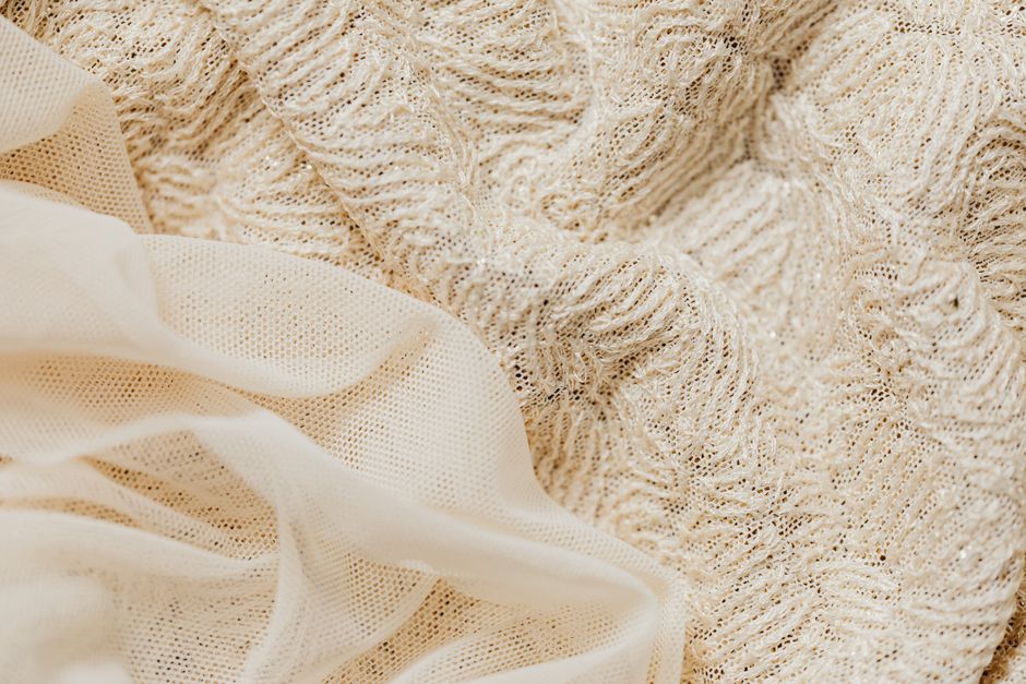
Comfort sounds subjective, but many of its ingredients are specific. Fabric hand—the way a textile feels when touched or worn—is one. A smooth fabric can feel cool and fluid; a brushed surface can feel soft and warm. Neither is automatically better. The right choice depends on climate, personal preference, and how the garment will be used. “Soft” is not a complete fabric description, especially if the product listing gives no fiber content or construction details.
Weight matters, too. A very light fabric may feel airy but can be transparent or fragile. A denser one may drape beautifully yet feel too warm for some sleepers. A premium sleep set balances those trade-offs for its intended use and gives shoppers enough information to make an informed choice. If a description calls a fabric breathable, it should say what the fabric is and how it is made; a comfort adjective alone is hard to evaluate.
Seams and closures should disappear in wear
Seam construction is where a set can either support comfort or quietly undermine it. Seam placement can reduce rubbing at the shoulders, inner thighs, and waistband. Smooth finishes and covered edges can make a difference for people who are sensitive to texture. Seamless construction is not always necessary, and it is not a magic sign of quality; what matters is whether the garment’s seams and joins feel appropriate for the design and lie comfortably against the body.

Closures deserve the same scrutiny. Buttons, snaps, drawcords, and elastic all bring their own sensory effects. A drawcord can help adjust fit, but a bulky knot may press into the stomach. A wide waistband may distribute pressure more comfortably than a narrow elastic, but only if it is not too tight. These small decisions can determine whether someone keeps wearing a set or leaves it folded in a drawer.
Sensory detail is not decoration
Sensory detail clothing is clothing designed with the wearer’s physical experience in mind. In sleepwear, that includes the cool touch of a fabric when first put on, the weight of a cuff, the sound of a textile moving, and whether a label scratches at the neck. It also includes how the garment shifts during sleep: whether a top rides up, whether trouser legs twist, and whether a waistband stays put without digging in.
Those details can be subtle, but they are not trivial. A high-end feeling often comes from the absence of little irritations. The set does not need to feel precious. It needs to feel resolved.
A Practical Checklist for a Premium Sleep Set
Before buying, look past the styling and check the garment information. The following details help separate a considered product from a polished photograph:
- Fiber and fabric information: Look for a clear fiber-content label and a description of the fabric or weave. If a claim is technical, look for supporting details. Fit notes: Check the rise, intended ease, and whether the set is designed for sleeping, lounging, or both. Construction: Look at seams, cuffs, hems, button attachments, and any areas likely to rub or bear tension. Care instructions: Read them before purchase. A garment that requires handling you will not realistically provide may not be a practical everyday luxury. Transparency: Notice whether the brand explains its claims and materials clearly, rather than asking shoppers to rely on broad wellness language.
When comparing two sets, try a simple test: What can you confirm from the product page, and what are you being asked to assume? A close-up of stitching, a legible fiber label, and specific care guidance offer more useful information than a string of mood words.
How Editorial Presentation Can Build Trust
A good article or product page should make details easy to find. For a Squarespace-hosted site, that can mean a clear hierarchy: a descriptive article title, readable subheadings, consistent author links, and image captions that identify what a reader is looking at. A Squarespace-style author page link—such as /author/name or another consistent site path—helps readers find the person behind the reporting. The exact URL structure is a site choice; the useful principle is consistency.
Image handling matters, too. A page might use images delivered through a Squarespace CDN, with an image source that follows a pattern such as images.squarespace-cdn.com/…. That technical detail is not proof of product quality, but clear images can help readers inspect fabric texture, seam finishes, and fit. Alt text and captions should describe what is actually shown, not make claims a photograph cannot establish.
Reader feedback can sharpen that coverage. A visible PAGE Reader Survey link gives readers a direct way to say what they want to know: perhaps whether a fabric https://bizzmarkblog.com/why-is-wellness-considered-luxury-now/ runs warm, how a waistband holds up, or whether the listed care instructions are practical. In a Squarespace site structure, that link can sit in the article, in a navigation menu, or alongside the author information. The important thing is that it is findable and clearly labeled.
The Set You’ll Keep Reaching For
The high-end sleep set is not necessarily the one with the most elaborate packaging or the grandest claim. It is the one whose quality survives contact with everyday life. Its fabric feels right for the wearer. Its seams and closures stay out of the way. Its cut bridges sleep and morning without pretending those are the same activity. And its brand gives enough information for a shopper to judge the product rather than simply imagine a mood.
That is the quieter definition of luxury: not an outfit reserved for an occasion, but a well-made piece that earns regular use. A premium sleep set can look restrained, but restraint is not the point. Comfort is. When the materials, construction, and sensory details support that comfort—and the brand is clear about what it is selling—the set feels considered long after the first impression.